About the project
Overview
Naro is not a client. It is a concept brand we built to answer a question prospects ask in different words every week: what do we actually get, and how far does it go.
So we took it the whole way. A mark with a reversed and a single colour version, a five colour palette with stated proportions, three typefaces divided strictly by job, and then the part most identities never reach: every application drawn from those decisions rather than mocked up by hand.
The challenge
Most identities stop at the logo
A logo is the easy part. What breaks a brand is the fortieth decision nobody made: which version of the mark goes on a dark ground, how much of the accent colour is too much, what size the wordmark stops being legible at, whether the caption on a social post is the serif or the mono.
Left unanswered, those get decided ad hoc by whoever is building the next thing, and the identity drifts within a quarter. Naro was built to close every one of them in writing, and then to prove each rule by applying it.
Chapter 01
One mark, three grounds
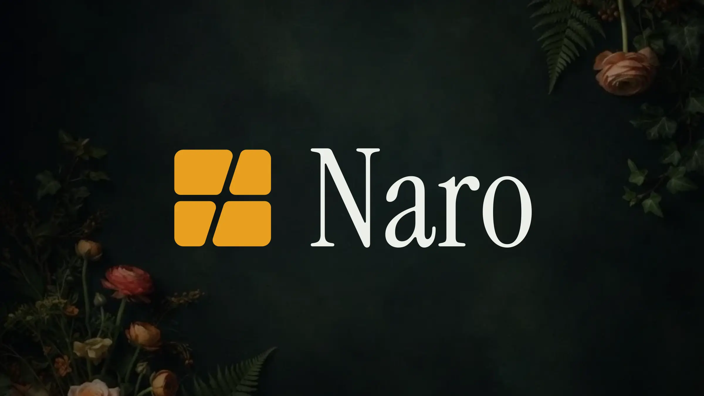
The mark ships in petrol for light surfaces, amber for the brand's own dark ground, and a single colour reversed version. Which one appears is a rule, not a preference, so a favicon and an app icon and a business card never disagree. The wordmark is outlined rather than live type, which is what stops it rendering in the wrong face the first time it lands somewhere we do not control.
Chapter 02
A palette with proportions, not just values
Five colours, each with a stated job: petrol as the primary ground, amber as the only signal, teal for links and small type, mist for secondary text and rules, chalk for light surfaces and body copy. The proportions are written down as 60, 30 and 10, because a palette without proportions is a list, and lists get used in equal measure by accident.
Chapter 03
Three faces, divided strictly by job
Instrument Serif carries display and headings and never goes below 24px, where its thin strokes collapse. Outfit does the small lockup, all interface, buttons and body. IBM Plex Mono takes labels, data and captions. The rule we wrote for it is the test: if you cannot say which job a piece of type is doing, it is set in the wrong face.
Chapter 04
Applied, not described
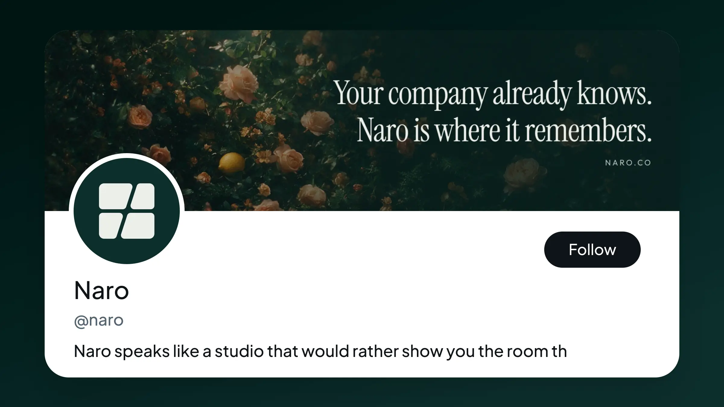
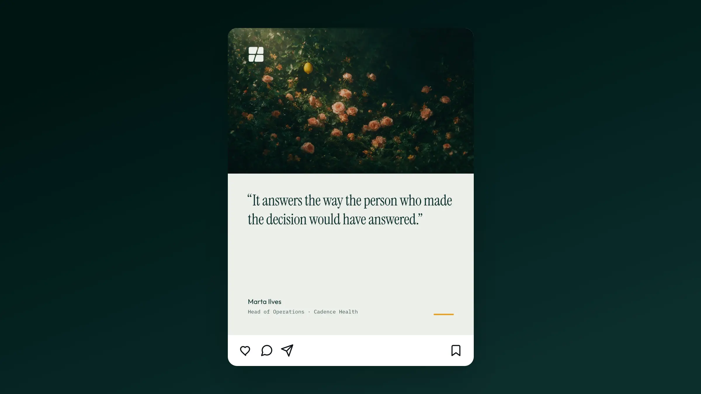
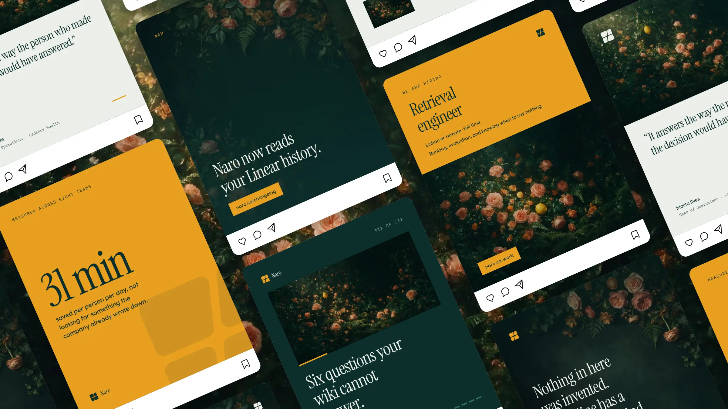
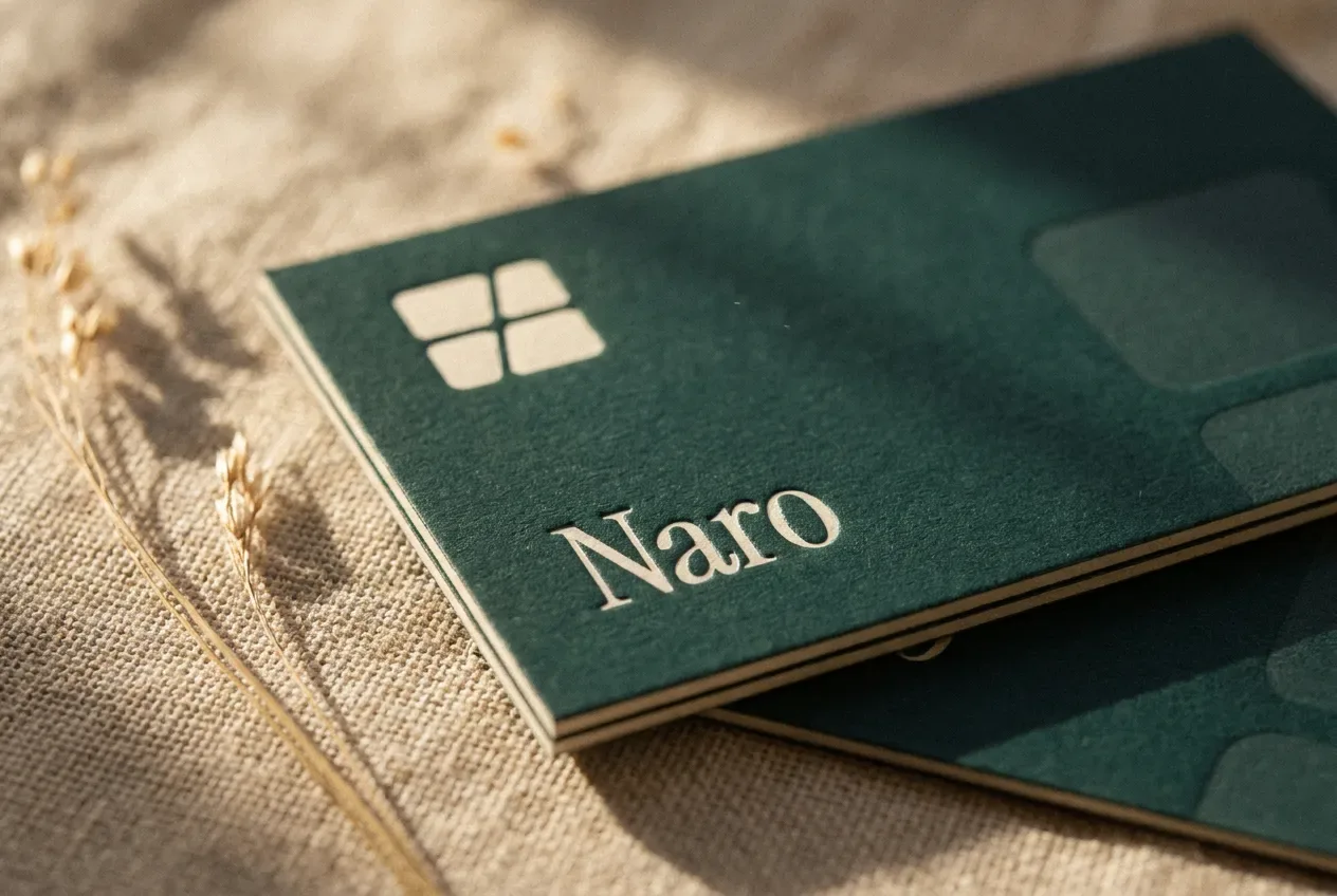
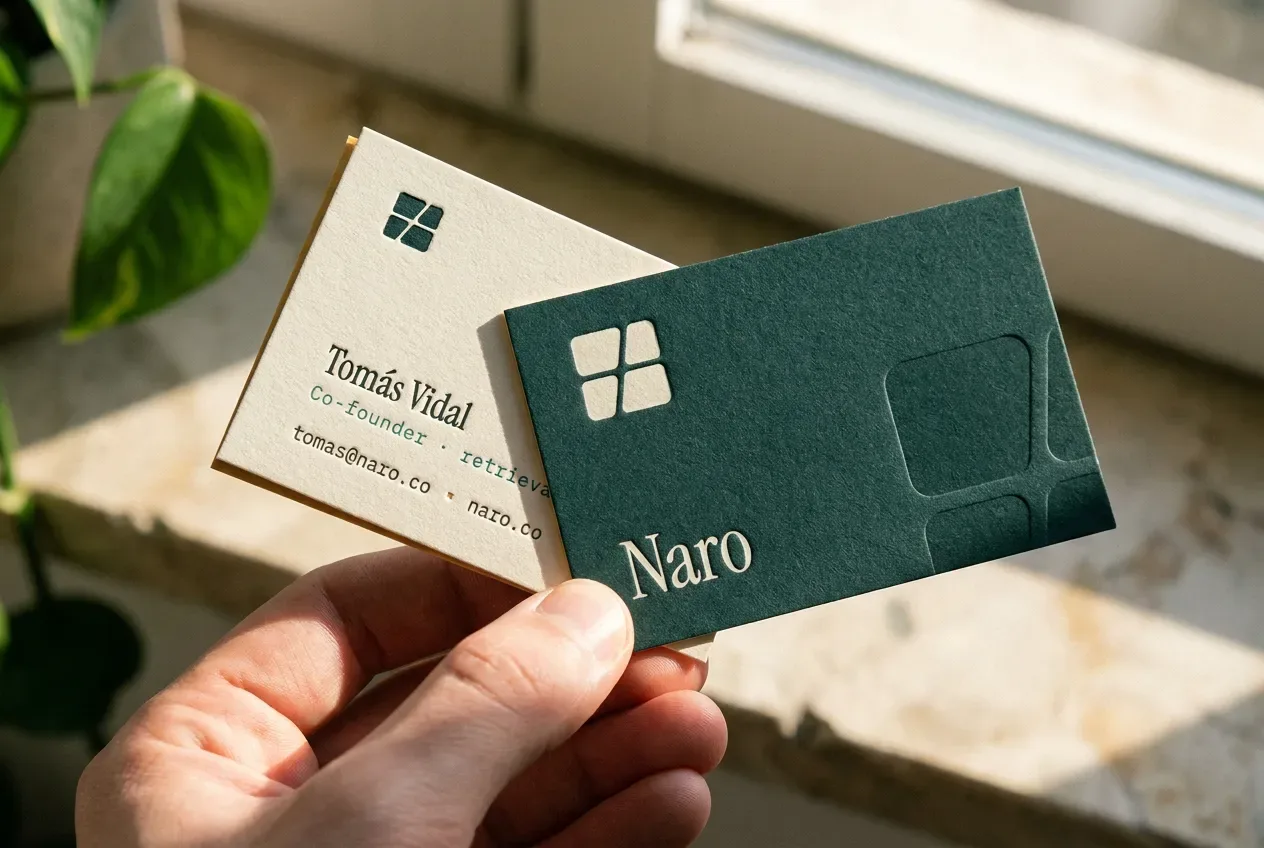
Every application on this page is drawn from the same tokens as the guide itself: the browser tab, the app icon among its neighbours, the social profile, the logo over photography, a single post, a feed six posts deep, and the card in petrol stock. Change a colour once and all of them redraw. That is the difference between a brand book and a brand system.